28/02/2014
Website Development
This month we have begun working on our websites in a workshop on Fridays with Rick. We began by purchasing our domain names, I chose Godaddy.com, and i selected the domain www.jadehindley.co.uk as I thought it sounded professional due to the Website research I conducted last term. We also chose our host websites, mine being cargocollective.com, and so I sent out a request to participate in the site which was accepted. So far I have browsed the templates, also going off the research I did where I found that for new illustrators it is best to have a really clean and easy to navigate layout, and selected a simple white background. Rick has also shown me how to create separate projects, with buttons to allow the viewer to move through each project quickly before selecting the next project. I think this tool allows my website to have the same functionality that I admired in Michelle Thompson's, with the portfolio style to it. I have chosen a header which reflects my work well in my opinion, as it is an image with the hand drawn pattern background, messy-styled black line, and a teacup which I drew with knives around the edge to provide narrative and meaning to it. In the future I think I will make my website look more individual, but for now my mantra is the plainer the better and let the work speak for itself.
27/02/2014
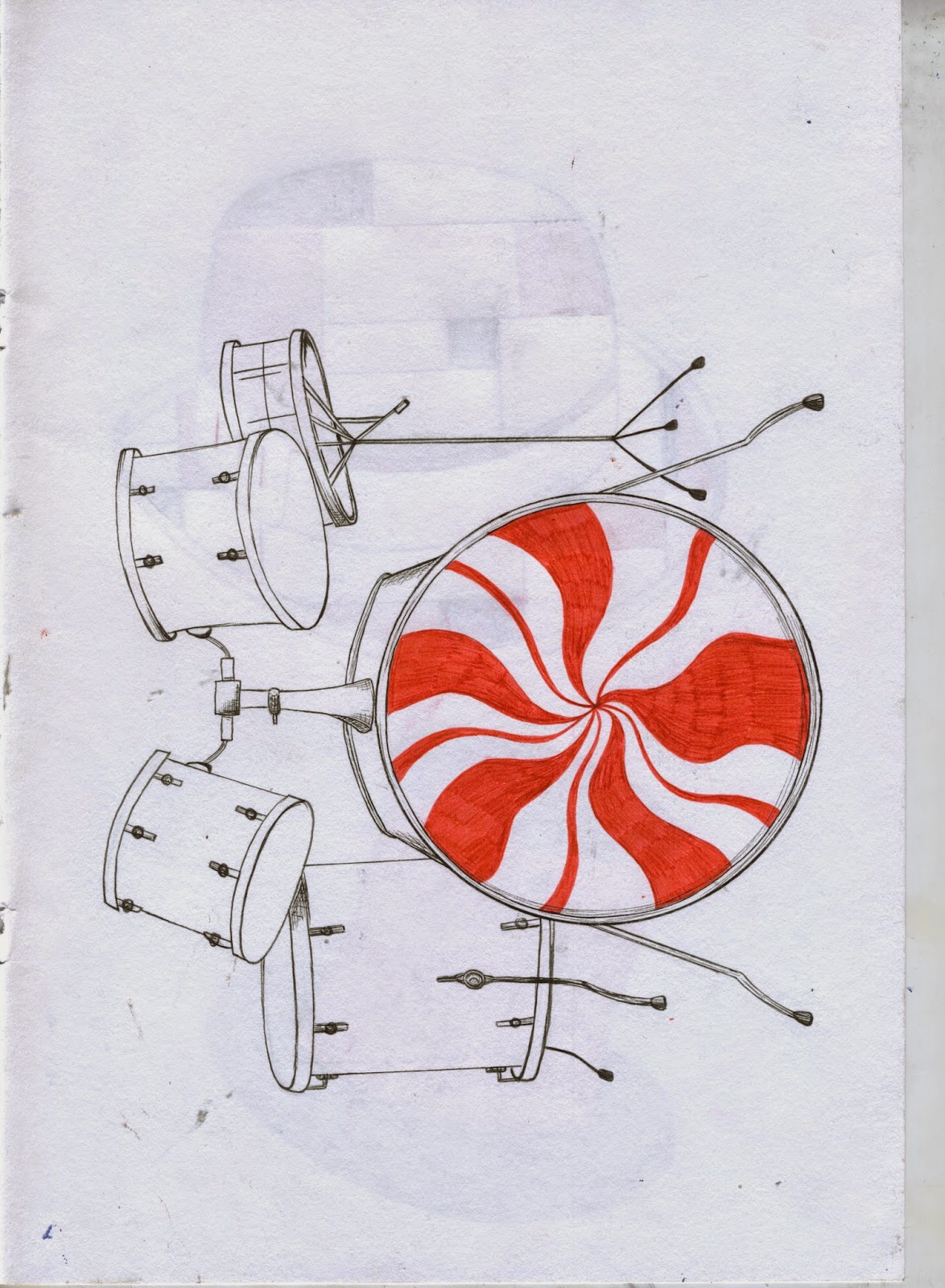
Major Project 1 - XL Recordings Drawing Development
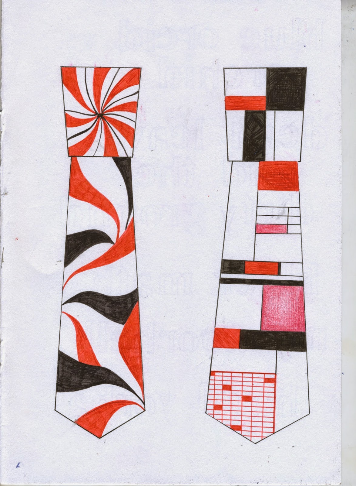
I have spent the past month drawing from the many different themes of the band. I have included them below and plan to now put them all on the computer and putting them together with background colours and textures.
I also used screen printing in the red black and white colour scheme to create some prints of the number three to use within my design and as separate pieces of their own.
18/02/2014
Lecture - Steve Scott
Today, we received a lecture from Steve Scott from Mortons Media Group. Although it didn't have much to do with illustration or my own work directly, it was really interesting and sad to hear about a print medium that has been around for so long, and the way the current digital age is morphing it and as a result having a arguably negative effect.
I have included some notes from the lecture below.
I have included some notes from the lecture below.
- Mortons of Horncastle began publishing local newspapers.
- They moved from single sheet letterpress to web offset method.
- In 2000 they sold their local newspaper accounts to Johnston Press but kept two monthly newspapers which were Old Bike Mart and Wrights Farming.
- They then acquired 22 magazine contracts for classic and heritage magazines.
- 3 years ago they began running focus groups to stay in touch with readers and found that promotion and distribution is a massive element to find their target audiences.
- Subject matter is very important - constantly ask "What do people want?"
- Printed word is diminishing and so the company has began moving to events and trade shows.
- Within 12 months they acquired 13 new events which revolve around the subjects of the magazines they are contracted to.
- In 2012 Ian Fisher became CEO of the Mortons Media Group and moved all divisions back together to create a multi-media company which aligned them with 21st Century needs.
- Today, they are the largest independent contract printers in the UK.
- Steve believed that " investment is vital if you care about the medium" which is a good lesson to take in any career path.
- He also strongly believed that print still has a future. They currently have 120 titles running each week, with the personal slogan "product mix is our uniqueness and our strength".
- Designers and photographers need to ensure their work is correctly edited for the publication that it will be used in.
- They also offer a digital printing service and are capable of printing up to SRA3 of single sheets to booklets.
- Letterpress moved to web offset which allowed publications to produce better quality prints in a much faster way.
- Now, machines can produce up to 86000 copies per hour.
- Recession, the internet, and a change in reading habits have harmed print media.
- However, in Steve's opinion, newspaper will be around for many more years but in a reduced format.
- Local communities will use micro publishing.
- There will be more products but more controlled target circulation and distribution.
- Digital printing, which will give the reader the opportunity to choose what they want.
15/02/2014
Portfolio Feedback 3 - Fig Taylor
Last Friday, Fig Taylor, a portfolio consultant, came into class for the day to discuss the development of our own hard and pdf portfolios. She began the day by conducting a tutorial on the general rules for a portfolio, followed by speaking to us in small groups to discuss our own in one to one conversations.
The main points from her tutorial were:
The main points from her tutorial were:
- There should be a recognisable style in your work, especially the work that is included in a portfolio, as clients should be able to see the distinctive method that you create imagery to know what they're getting when they hire you.
- When you graduate you really need to put yourself out there and sell yourself as an individual who can offer something different and fresh.
- Always research companies or people that you are sending work to! You should really know who you're dealing with in order to get everything you can from the contact.
- People who want to commission work do not want to see all the mistakes and unimpressive attempts that your tutors and people who assess your work do. Make sure what they see is the best of the best.
- When creating a portfolio you need to be objective in order to be your own critic. Her exact words were "remove anything that makes you wince"(!).
- If you don't like a piece of work, chances are most other people won't either, don't include anything you wouldn't want to see in someone else's portfolio.
- In a print portfolio, do NOT use any heavy mounting boards.
- They should be in a good order that flows well, and only the best work as anything else is just a waste of time and space.
- If you are taking a digital portfolio to someone, a tablet is preferable over a laptop as they take a lot longer to load and can be difficult to navigate.
- If you are including photographs of work in your portfolio, make sure they are really high quality as bad quality renders the work pointless and highlights a lack of skills and knowledge.
- There is no perfect amount of pieces for a portfolio, just include what you feel is necessary to get what your work is about across.
- Have a professional Facebook, twitter, website, and online shop such as etsy. Clients do not want to see your drunk photos from last weekend.
During the one to one advice, Fig reiterated some of the points she had made earlier in relation to my portfolio, and her comments on my actual work were based around the quite conceptual and masculine feel to some of it. She said she could see my work being used in magazine and news editorials, in relation to politics and social issues which means I must be doing something right as these are exactly what I've been thinking I'd like to focus on. Her advice was to start making work based on news articles and put them in a layout so that a client could imagine them being used this way. She also pointed out that other pieces of my work are quite the opposite and have a decorative style, so I should look into putting this type of work onto products and starting an etsy online shop to provide myself with more scope.
All these points seem obvious once you've heard them, but a lot of them you wouldn't think of usually. As a result of this, and the more industry based advice, I have gained some priceless insight and really relevant and up to date advice from a professional.
12/02/2014
Lecture - Holly Wales
Yesterday, Holly Wales, an illustrator from London came to Stockport College. It was wonderful to see a young woman who has done really well in the industry, and remained really lovely and down to earth.
Most of her talk was just going through her beautiful artwork, and detailing her commissions and the way she has made a name for herself. She also talked a lot about technique and visual language, and how important it is to find your voice through creating art. In addition, Holly talked about the little marks and mistakes that occur on a page when creating handmade work, and the pressure illustrators feel to photoshop all these little parts out. Her view is that these features thoroughly enhance the feel of her work, which i wholeheartedly agree with.
Her explanation of being inspired, not by things around her, but through experimentation with new processes and techniques also caught my attention, as I have always enjoyed the beginning playing part of a brief. I find it very beneficial to make the same image in different medias to find the correct medium for the image, which I think comes from fine art classes in previous education.
Furthermore, she talked about her fondness for maps, and how fun they are to draw, which I also really relate to. I have always been a big believer that a good map is more interesting to look at than a lot of art or design. My second project for FMP is going to be based around the notion of Wanderlust so I'm sure I'll be taking some influence from Holly's work with places(shown below).
Subscribe to:
Comments (Atom)


