17/04/2014

Hopes, Fears, and Opportunities Part 2

My first aim from my Hopes, Fears, and Opportunities post last December was about discovering and pinning down a definite working method and style for my work and me. I think I have achieved this goal and am sure of how I tackle a brief, however I'm not sure if I am done experimenting, which in my opinion is a good thing. 

Before December I played with different types of drawing and the tools to do this, and found the way I loved to create pictures. I then explored, from the advice of my tutors different ways to add depth to these drawings, which I am still doing now. In this term I have tackled screen-printing, t-shirt painting, sewing, photoshop, illustrator, and collage to find different ways of taking my work further than just pen on paper. Although some things have worked, and some things haven’t I feel I have been learning the whole time.

I have found all the different contacts with industry really valuable, and a lot of the information will be applicable in a variety of fields after I leave university.

I have not found the time to explore animation any further this term which I am disappointed about, but I firmly believe that just because I’m graduating it doesn’t mean I’m done with education, and have been researching different courses I can do to gain new skills.

I have got back in to using Adobe Illustrator in my most recent Wanderlust project, creating simplified abstract maps using the program, and I have found it somewhat time-consuming, but extremely rewarding, as with this tool what you imagine in your head is usually how it turns out, which is not always the case when doing work by hand. I am really happy with the way these have turned out and am excited to start making more detailed imagery in this way. However I do not want to lose the handmade feel in my work as I find it a lot more pleasing aesthetically, and so have begun to combine the illustrator work with my drawings and textures.

Creating a website has also been a new step for me, as although I have selected templates and chosen fonts for blogs etc before, there is a lot more freedom with the cargo design feature, and I am really happy with the way this has turned out.


I am glad I have quite closely stuck to the themes that I planned in my last post for FMP. I explained my choice of the word Wanderlust as my inspiration, and I have also explored making work relating to music which is one of my passions and something I’d love to continue doing after I leave university.


Overall, I’m really happy with the way it is going at the moment, and my only real problem is that it has gone too fast and I wish I’d had more time to explore the subjects deeper. I am glad that I chose to take on two projects over the FMP as I worry if I focused on one for the whole time I would of lost momentum.

Major Project 2 - Wanderlust Development

I have been working on a series of posters on illustrator, conveying abstract flat colour maps of cities that I chose based on research of top tourist spots. I found simple maps of each place to inform the shapes and photoshopped them to give a more textural, muted feel. I am really happy with the outcomes and plan to keep developing them by adding drawn objects on photoshop.


15/04/2014

Business Cards

Today I have been finalising my business card designs and have just sent them off to be printed. I didn't realise how much work it would take to get everything to the right size and arrange the layout to comply with the printing site. Hopefully they should be here by the end of the week so I shall post again when they come!


14/04/2014

Portfolio Feedback 6 - Alan Dalby

After receiving advice on my PDF portfolio from Alan in December, as well as others, I redid the whole thing and have ended up with, in my opinion, a much better result. I emailed it to Alan again recently and his feedback is once again really helpful and to the point. Below I have included parts of his email response and my opinions of them.

That looks much cleaner and much stronger than your earlier portfolio.

Seeing it like this, I see a few more changes that could be made.

The logo on each page seems a bit over the top now, and I’d stick with it on the cover only.

This is an interesting point, however it contradicts other advice I have been given and so I will have a look and get advice from my peers to see what works better aesthetically as in my opinion the logo on each page enhances the portfolio.

Some of the type still jumps around a little bit as i flick through the images.

I have looked at the pdf and on one page the type at the bottom is in a different place which can be easily fixed.

The black key line around the images lowers the overall aesthetic of the portfolio.

I placed a thin line around the images with a white background upon the advice of Gary from a portfolio feedback session in December, but i shall see if editing the line to make it even thinner, or removing it completely would be more appropriate.

You’ve got some really strong work, but it feels a bit inconsistent at times.

Personally, I think your stronger stuff is the hand-drawn elements, (the wavy hair is particularly charming).

This has always been a problem for me as it took a long time to get my working method to a more finalised state, so the work from earlier projects looks a lot different to my work now. I have tried to remove the less appealing work from the portfolio and make it more consistent, and I've tried to organise the portfolio into similar methods and palettes. I think the only thing I can do for this issue is keep making work and updating my portfolio until it inevitably ends up the way it should.

The left white stripes poster is a lot stronger than the other two, but it gets a bit over powered when next to them.

Some full page landscape spreads might work really well in there.

When editing the portfolio I did think that I should perhaps spread the images out, however I was worried it would end up being too big. I do agree that The White Stripes main image should have it's own page, and value this kind of advice as it is just the small details that make a massive difference.

I know this can’t be done now, but in future I think you could benefit from spending time working on personal work, and getting rid of some of the pieces you don’t feel belong with the portfolio.
Make it into a more solid body of work. Just getting your style down to what you want to do.

This is a really good point, made quite regularly by a variety of people, as I think my method is often lead by briefs, and so spending time working on the kind of topics that I want to work with will lead to, as Alan says, a solid body of work. 


04/04/2014

Website Development 2

I have pretty much completed my website on the cargo collective site, and when looking in to linking it with my domain name found that you have to upgrade by paying a monthly fee. For now I do not have the means to do this, so for now my website shall stay under the url I have with cargo. I have uploaded only a few pieces as I feel I should only show my best on the website, and have written a simple "about" and "contact" section. Rick also showed me how to link my blog so it is pretty much completed. Take a look!

cargocollective.com/jadehindley

31/03/2014

Major Project 2 - Wanderlust

I have recently been working on my second project of this module, which I have entitled Wanderlust. I chose to focus on travel and exploration as, with graduation coming up, I am entering a new chapter, and this topic is all I'm really thinking about.

Wanderlust : the strong desire to travel,   adventure.

So far, I have been concentrating on places that I have been to, but looking at them from a hypothetical tourists perspective rather than what it's actually like when you're there as I feel this way has more functionality and links to the project title more. I have been creating travel journals on 6 places that I have been to that I plan to turn into travel guides once completed.

I plan to go on to focus on some places that I want to go to, as it is this type of emotional response when dreaming of a perfect, idyllic place that I plan to convey. I plan to do this through the use of maps and illustration.

I will update with images soon!

28/03/2014

Portfolio Feedback 5 - Dayjob

http://day-job.org

Whilst in London we visited Dayjob, an illustration collaborative who work from a studio in Peckham. Their work has a beautiful handmade feel to it, and the studio had a really fun friendly atmosphere. Some of the girls had a look at our portfolios and gave us some great advice.

One point they made was that there was a little too much work in my portfolio, and I should select maybe 15 pieces that I feel are my best work. They pointed out a few that they recommended I keep and a couple that I should remove.

Another piece of advice was that it is best to include work that you want to keep doing, and so some of my pieces that are things that I wouldn't want to do again shouldn't be in the portfolio. They recommended making personal work in the style, and using subjects, that I would like to take into my career and include them in the portfolio.

There was also still one slightly blurry/pixelated image which they made a strong point about, as having something like that in your portfolio tells a client that you cannot work basic computer skills so I will redo that image to ensure it doesn't happen again.

They agreed with Fig Taylor, in that my work has quite a conceptual feel to it that would be best suited to editorial work, which is great for me as that is what I would prefer to be doing.

Some other pieces of advice that the girls gave us as a group were:

  • to constantly enter into as many competitions as you can as it provides you with a brief to work with when you don't have paid work (to keep the creative juices flowing!) and works as a kind of practice of your craft, as well as providing you with great exposure and gets your work out there at the very least.
  • to get a studio! All the dayjob girls agreed that having a studio has a really positive effect on your work. As well as motivating them to do work, rather than procrastinating or getting distracted at home, it allows them to bounce ideas off each other.
  • they also recommended working a collaborative way (obviously!) as having people with different skill sets around you really enhances your own and other peoples work. Also it makes you more functional as an employee as there is a lot more you can offer to clients

27/03/2014

London

This week some students from my class travelled to London with tutors Jo and Ian to make contacts with industry and explore possibilities for after we leave university.

We started the first day with a trip to Adam and Eve DDB Ad Agency, to meet with Daniel Moorey who is head of print, and the art buyer there. He discussed the way the industry works and the methods he uses to go about finding illustrators appropriate for each job by showing us his book marks and the way he categorises different work. He also talked about illustrators websites, and reiterated a lot of the points that I found when doing my own website research including simplicity , and ease of navigation, as well as having small or medium sized thumbnails of work to allow the viewer to select images that they want to look at closer whilst still being able to see the whole body of work at one time. He also pointed out that if you have two different ways of working you should have them obviously separated within your site, or even create a separate one for each.

On the second day we visited Naomi Games' house, where she keeps the archive of her father Abram Games. We had the privilege of looking through his working drawings, colour ideas processes and final poster designs with Naomi talking us through the different projects and his thinking within them. We also were lucky enough to watch her make coffee in Games' iconic Cona coffee maker which he designed by modifying the original structure. It was incredible to see the amount of work and many variations of each design that he went through, and the huge amount of skill and talent that he had when using his airbrush (which we were also allowed to examine). It was an absolute pleasure and thank you to Naomi for having us!


After the wonderful experiences we had here, the thing I enjoyed the most was getting to have one final trip away with my class before we graduate. I'm really going to miss being in this environment and seeing all these wonderful people everyday, and am very aware of how lucky I am to have had such a positive and fulfilling university experience.


24/03/2014

Fees and Invoicing Workshop

Ian put on a really helpful fees workshop in uni recently covering the following topics. It will be a useful tool as it is not often discussed how much illustrators should be paid, and there aren't really any published set amounts for what to charge for different work. This is because the price of a piece is dependent on a range of variables. 

Money

 Either:
  • the client tells you what the budget is and you have the ability to accept, negotiate, or decline the amount
OR
  • the client asks what you will charge and you have to come up with an amount
We then discussed the different questions you should as to educate your price in the event of the second occurring.

How will it be used?
This is in regards to print run, territory and exposure, copyright, and time scale.

Expenses?
Will you need to purchase any supplies in order to complete the work?

How long will the work take?
For this you should decide on an hourly rate, which was a bit confusing to me, as I was unsure as to whether this would then cover breaks etc. 

Clients profile?
If the client is a well known company it would ensure you would receive exposure which in turn could mean you should demand a high price. Alternatively, bigger companies may be able to afford to pay more and should you then demand more money. 

Do you want to do the job?
This is important as something you'll enjoy doing might mean you accept less money than doing work for a brief that you dislike. 

What is the going industry rate?

Editorial
  • Front cover £350-£500
  • Full page (inside) £250-£400
  • DPS (inside) £350-£500
  • Half page £200-£300
  • Quarter page £150-£250
Publishing 
  • Front cover £450-£800
  • Reprint/New territory usage 50% original fee
Design
  • Brochure cover £600-£800
  • Insides £150-£300
  • Spots £50-£100
  • In house poster for PLC £600-£800
Children's Books
-Usually based on page/image rate
  • just illustrating £2500-£3000
  • educational = less v story = more
Advertising
-Fees vary dramatically based on client
-Style not ideas
-Usually work from their sketches
-Above the line = mass media v Below the line = individual bespoke
  • Press ads local/In house £500-£700
  • Press ads national £1500+
  • 48 sheet poster (billboard) £6000+
We also discussed should you ever and when it is worth it to work for free. 
One example is when it is for a pitch or speculative work that has been suggested by an Ad Agency, as this could lead to a potentially huge job. Another is for charities, or companies such as the V&A as it is providing you with exposure and filling out your portfolio with live briefs. It is also a great way of gaining experience and could lead to other opportunities. Ian did point out that you should try to charge for expenses as there is working for free, and then there's paying to work. He also made the point that we need to be careful to avoid being exploited, as recent graduates are particularly vulnerable to this, and to not let it lead to the erosion of fees and undermining of the profession. 

Invoices

Another topic we went over was the matter of invoices. He gave us some tips by showing us an example which I have detailed below.

Include:
  • your logo should be personal, be professional, stand out, brand you, and identify it
  • invoice number from your own numbering system
  • a date and keep a record for assistance
  • customer reference through a number or who you have worked with
  • bill to name and address (call to check who this should be)
  • quantity/job description/amount to justify why you are being paid
  • commissioned by.../issue no./date of use
  • your account details to be paid into (possibly an international bank number)
  • address/email/phone number
Tips:
  • Keep a copy of all invoices
  • Keep records of payments/outstanding balance
  • Only send an invoice after work has been accepted and wait a couple of days
  • Call accounts department after 1/2 months
Overall this workshop gave me a lot of information that I feel is necessary knowledge for anyone hoping to work in this industry and I would of had a very hard time trying to work with a client if I did not attend. Thanks Ian!


22/03/2014

Portfolio Feedback 4 - Wendy Lewis

I have always been interested in interior and product design and really enjoyed the wallpaper design brief that i participated in last year. I have thought for a while that it would be interesting pursuing this side of illustration after leaving university. To help me see if my work would function in this way, and to gain advice on how to alter my portfolio for this type of client I contacted Wendy Lewis, co founder of The Design Hub, and interior design and wallpaper specialist company from Altrincham and met at her showroom.

Wendy's main comments were based around the way my work could work in her industry, and so it became a discussion of the different ways i could use simplifying techniques to make the imagery appropriate for repeat pattern and ensuring they are scalable to be transferable into textile and commercial wallpaper. The Imaginary Beings imagery of the frames surrounded by coral were discussed in relation to how they could look "stunning" in a range of fine white porcelain which I thought was an exciting possibility. Wendy also pointed out how the use of frames and delicate detailing is quite fashionable with ceramics at the moment.

Another route that would be suitable according to Wendy was wallpaper murals, which are in high demand at the moment and the consumer is looking out for companies with new and exciting illustration. She also described The White Stripes designs as really strong and said she could imagine them going straight to manufacture as wallpaper murals. She did however say that a lot of the most popular work at the moment is flat colour based, and created using Adobe Illustrator, so I may explore this in my current Wanderlust project.

I also asked Wendy about how I would go about getting involved with wallpaper and product design which she said I would really have to contact the major players and brands, such as Harlequin, Osborne and Little, to try and get an internship in the studios as she believed this was the best way in. She recommended creating more work similar to the ones she has pointed out and tailoring my portfolio to this audience.

When I enquired about printing myself she recommended John Mark Watson (www.johnmark.co.uk) who she knew and loved, and also told me to avoid a company called Digitex who apparently "rip off all new designers and produce as their own". So thanks for that one! She also pointed out that my work could look really interesting and work printed on roller blinds which the previous company offers so to look into that.

Conclusively, I found this meeting very informative, and throughly enjoyed spending time in the showroom environment surrounded by the beautiful designs and seeing the way they are carried through a range.


19/03/2014

Major Project 1 - D&AD/XL Recordings Deadline

Today is the deadline for the competition pieces I've been working on, so i've spent the day making sure all the specs are in order and submitting my work. Here is the work I ended up sending.


Final a1 poster design. 
-Handmade splat-style type.
-Map of Brazil to locate the event.
-Pick illustrations in the background to highlight the bands main themes.
-Tools in the foreground to reflect Jack White's upholstery background and the approach the band has to creating music.
-Black, White and Red colour scheme aligned with the band's.


Website Illustration
-handmade type of the setlist of the event
-drawn mark making from a fabric stain
-small illustrations of decorative records and White Blood Cells after album name
-black red and white colour scheme


Research Illustration - The Amazon
-drawing of the Amazon Theatre
-drawing of the animals from the location
-drawing of an amp to symbolise what the event that took place was
-edited map of Brazil in the correct colour scheme


Research Illustration - The Number Three
-Number 3 hand drawing
-Fabric pattern background to tie in with upholstery theme as that is where the notion of the number originates
-wooden texture background to tie in with upholstery theme

Research Illustration - The Instruments
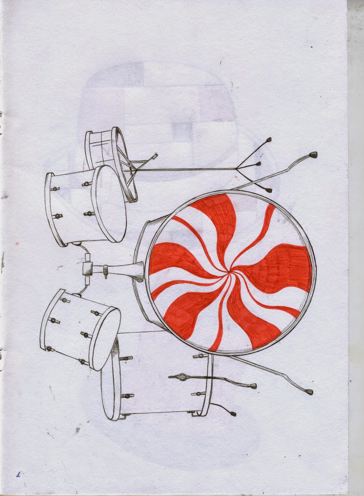
-drawings of the three instruments used by the band repeated in a similar way to one of their gig posters
-screen printed number 3 repeated three times


Research Illustration - The Band Members
-drawings of the two band members moulded together as a symbol for their relationship (brother and sister? husband and wife? best friends?)
-handmade background to reflect their approach to music
-pick illustrations in background again as it is their beliefs and ideas.

06/03/2014

Major Project 1 - XL Recordings Poster Development

Here are some examples of my work in progress poster designs.


I like the drawing of the hand but am struggling to find an appropriate background as everything I have tried so far is clashing terribly. I do like the idea of having a map in the background, perhaps edited in some way.


This image is too busy for me, and Ian directed me that the photo in the background would cause copyright issues and so this either needs to be forgotten or played with some more to make the photo less like the original.


I plan to remove the faces from this drawing as they do not look enough like the actual people. However, I like the repeated picks in the background and will try to develop this idea , maybe in a more subtle way. I also like the map and theatre being included in the T shirt as I was struggling to find a method of highlighting the location of the event without it being an overpowering theme.


For one of my research images to submit I plan to have one that is purely about the instruments. I want it to be as simple as possible as the drawings are quite detailed. This, however, definitely needs more work as I think the red should be more of an accent than the main colour.


Experimentation with the handmade type of the setlist and the smaller mark making drawings that I have created. I would like my website illustration to take this form, but I want to develop it into a more collagey, cut and paste style as this looks a bit too digitally crafted. 

03/03/2014

Promo Workshop

My recent run in with Promo Bingo was definitely a treat, as well as being extremely informative.

Gary and Ian lead a seminar to explore the pros and cons of different types of promotion which I will detail below.

Working together/in a collective rather than alone...

Advantages

  • You can bounce ideas off each other
  • Bring together different skills
  • It is time saving as you spread the work
  • You can share the costs of supplies and tools
Disadvantages
  • Too many ideas may get confusing
  • There may be disagreements
  • Distractions
  • You have to split the profits
Having an agent...

Advantages
  • Gives you connections that you wouldn't normally have
  • It is another way to get work seen
  • Saves you time as they do the promotional side
  • It gives you and your work credibility as agencies have a quality control method
Disadvantages
  • They take a percentage of your payment
  • They may get you jobs that you don't want
  • Your work may be directed in a way that you don't want it to go with regards to technique and aesthetic

We also discussed the things you should and shouldn't do in terms of portolios and portfolio visits.

Portfolios...

Advantages/What To Do
  • Get feedback from clients
  • Can leave it with a client
  • Look professional
  • Target it to your audience
  • Only show your best work
  • Controlled layout
  • Keep it up to date
Disadvantages/What Not To Do
  • Limits what you show compared to a website
  • Don't include blurry/pixelated/bad quality images
  • Don't show really old work
Portfolio Visits...
  • Be confident and professional
  • Be enthusiastic
  • Look smart
  • Research the artist/company
  • Prepare how you will talk about your work
  • Leave a business card etc
We also discussed how to build a client list, with regards to researching companies that match your personal style and then networking and securing an agent based on this research.

28/02/2014

Website Development

This month we have begun working on our websites in a workshop on Fridays with Rick. We began by purchasing our domain names, I chose Godaddy.com, and i selected the domain www.jadehindley.co.uk as I thought it sounded professional due to the Website research I conducted last term. We also chose our host websites, mine being cargocollective.com, and so I sent out a request to participate in the site which was accepted. So far I have browsed the templates, also going off the research I did where I found that for new illustrators it is best to have a really clean and easy to navigate layout, and selected a simple white background. Rick has also shown me how to create separate projects, with buttons to allow the viewer to move through each project quickly before selecting the next project. I think this tool allows my website to have the same functionality that I admired in Michelle Thompson's, with the portfolio style to it. I have chosen a header which reflects my work well in my opinion, as it is an image with the hand drawn pattern background, messy-styled black line, and a teacup which I drew with knives around the edge to provide narrative and meaning to it. In the future I think I will make my website look more individual, but for now my mantra is the plainer the better and let the work speak for itself.

27/02/2014

Major Project 1 - XL Recordings Drawing Development

I have spent the past month drawing from the many different themes of the band. I have included them below and plan to now put them all on the computer and putting them together with background colours and textures.


I also used screen printing in the red black and white colour scheme to create some prints of the number three to use within my design and as separate pieces of their own.